Game Design Research
When considering mobile devices, it's essential to note that certain areas are more accessible depending on the device's orientation. Optimal practice dictates situating interactions within easily reachable zones for user comfort and convenience. This strategy not only enhances user experience but also facilitates monetization avenues such as incorporating a store, links to other apps, and advertisements.
Monetization efforts, though lucrative, can sometimes tread into what's known as "dark UX," where users engage with interactions inadvertently. For instance, scrolling interactions prove beneficial for navigating excessive content or presenting numerous options beyond the main screen. To optimize this feature, it's advisable to make these items partially visible, signaling to users that more content is available for interaction. Employing animations from end to start upon launch adds a dynamic touch to the user experience.
In scenarios involving in-app purchases within scrolling interactions, it's crucial to keep elements visible and incorporate clear calls-to-action to prompt purchases effectively. Pop-ups, typically utilized for conveying abstract or informational messages, can enhance user engagement when paired with function initiators. Employing semi-transparent or dimmed backgrounds to overlay content onto the original screen serves to highlight active areas while indicating a paused state in the background.
An effective strategy to improve user interaction with pop-ups involves eschewing the conventional "x" icon for closure. Instead, placing an action button at the bottom of the pop-up encourages users to engage with the message and make informed decisions based on the content presented. Additionally, the integration of reward videos, such as offering extra coins for watching ads, has become a standard practice, significantly bolstering monetization efforts.
Game Design UX Best Practices by Amir Dori
Visual Thinking Analysis
This is one of my plant babies, It's a Phalaenopsis Orchid. I got it as a gift in early december so I have been taking care of it for just under 3 months. It is actually dying, I am currently trying to nurse it back but it’s been difficult with the lack of sunlight.
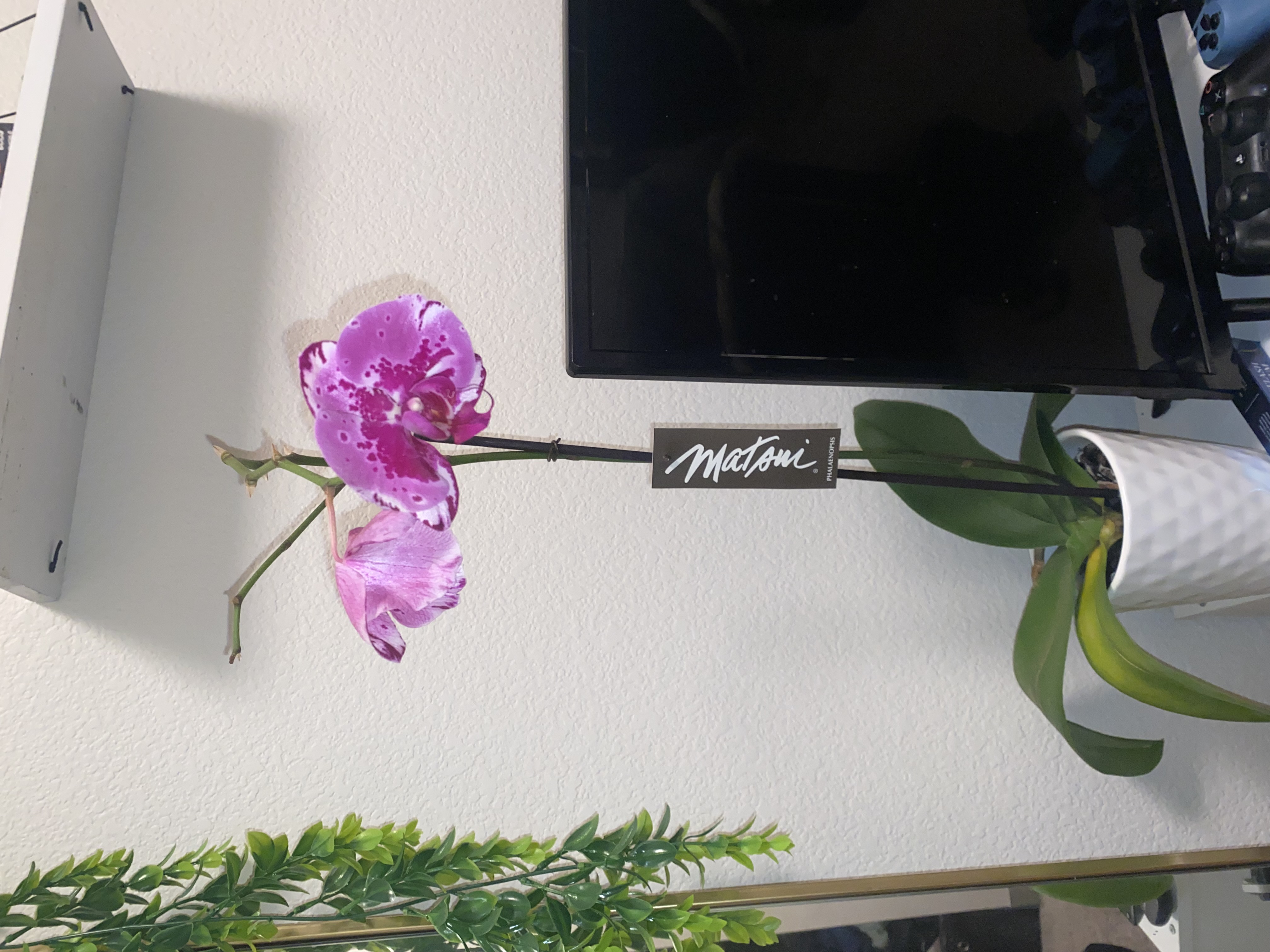
My collection is about my plants; I find the task of taking care of and learning about them very relaxing. This image in particular is of the newest addition in the collection. All my plants carry great significance whether it’s because of the timing I got them or just how I have grown and learned with them. They all have fun stories and have had bad times as well where I have had to nurse them into health. I love plants, not so much flowers, but the orchid is a plant which blooms very vibrant flowers and is not a bush like plant. Flowers tend to come on a bush or in a bouquet, a bush in my room would not be very appealing and bouquets are not meant to last very long. Because of that I believe the Orchid is a perfect flower plant, adding aspects of aesthetics, pops of color, and a cute presence to my space for years to come.
My collection reveals that I love plants even though I have just a few right now, I hope to expand my collection. I find the presence of my plants to be very calming, they give me a sense of control.

The image is about Legos the Botanical Collection sets, specifically the orchid set. It has pretty orchid flowers and even comes with a pot and mimics an actual orchid very well.
The most interesting thing was when my partner presented her images, she said they were legos. I found it very funny that I hadn’t realized the plants were made entirely of lego pieces. The colors within the image are organic and plant like, specs of pink in the middle of the buds and the forest green stem + leaves. The pot of the plant adds a lot of dimensions and makes it look much more realistic, it also adds to the display of the set. It even includes the stick to keep the stem up, it’s all very realistic and fun to look into the details of the piece.
The most obvious aspect of the image is that it is an orchid, an orchid made from lego pieces. The image is really intriguing, I wish I could look at it in more detail just to see how realistic they’ve made the set, what other small details were added to make it seem so real. Emotions that Yilan shared about her collection were the emotions she feels while in the process of building and ever after. Lego builders enjoy time relaxing and focusing on something fun and feel a proud sense of accomplishment when they finish.
Visual Thinking Strategies Research
When it comes to visual communication it is important to try and digest as much information as possible. In opposition, as a designer it's crucial to understand how people understand visual content to create products that are visually appealing and comprehensible. The article 10 Intriguing Photographs to Teach Close Reading and Visual Thinking Skills, linked below, goes over some strategies on how to delve deeper into visual content including methods like, acting detective, noticing details, learning from others thoughts, asking questions, starting conversations, and practicing.
Platforms such as Airbnb boast a plethora of uploaded images, each deliberately chosen to showcase different rooms within a property. As users browse the booking page, they engage with a slideshow-like display, carefully inspecting each image to assess whether the Airbnb listing aligns with their preferences. In their quest for the perfect accommodation, users prioritize comfort and aesthetics, among other factors.
The details depicted in these images hold significant value for both renters and hosts alike, offering a comprehensive insight into the property's amenities and ambiance. It is through these visuals that potential guests and hosts can make informed decisions, ensuring a mutually satisfying rental experience.
10 Intriguing Photographs to Teach Close Reading and Visual Thinking Skills by Michael Gonchar
Optimal Practices for Modals/Overlays
Modals or overlays serve as a distinctive window within the existing web page structure, providing developers with the ability to construct an independent, interactive layer atop the elements on the page. To navigate this design landscape effectively, it's crucial to close modals, allowing users to seamlessly transition back to the parent page. Modals, often in the form of pop-ups, strategically interrupt user interactions, typically collecting data or unveiling additional information.
Yet, easily overlooked and becoming an intrinsic part of our online routine, despite their unassuming nature, these modal gems play a vital role in data collection and can be tailored for various intentions, subtly guiding users through their digital journey.
It's worth noting that modals have become so ingrained in our online interactions that we might be unaware of their prevalence. They seamlessly integrate into the web landscape, often prompting users with essential messages, such as the playful reminder to 'accept your cookies'—a nod to the ubiquitous cookie consent prompts. When developing modals, ensure they align with design elements such as window structure, type hierarchy, buttons, and text, contributing to a seamless and visually cohesive user experience.
Best Practices for Modals / Overlays / Dialog Windows by Naema Baskanderi
Research Form Design
I conducted quick form design research and found that designing forms has a particular set of standards to aid in the users navigation. An approach that focuses on ensuring conciseness, by including only relevant information, aims to prevent cognitive overload and create a form that is easy to read and follow. Usually, forms are structured in a single column to guide users through a seamless vertical motion, with exceptions made for small content items like zip codes or states.
To enhance user experience, it is beneficial to display a progression indicator, allowing users to track completed steps and gauge the remaining ones. When it comes to form mannerisms, consider marking questions that require answers with an asterisk. Place more complex questions towards the end, beginning with simpler ones. Additionally, provide support text to explain formatting requirements rather than using placeholder text. Use labels instead of placeholders to maintain clarity while users input information, and if providing examples, incorporate supporting text.
For a sleek design, adjust the size of fields based on content length. Default values, although requiring thorough research, can significantly reduce the information users need to input. When utilizing drop-down or multi-select questions, carefully choose the format that best suits the question and form guide, such as checkboxes or radio buttons. Avoid generic button labels like "submit" or "send" and opt for labels that align with the form's purpose. Link to the article:
Best Practices for Form Design by Salim Ansari
In my own expereinces with forms I have usually had something to complain about within the design. A form I'm very familiar is the FAFSA Student Aid form. The navigation of the form is fairly easy to follow, often times there is an icon for additional information but the form is so lengthy it's difficult to complete in one sitting. A great thing about this form is that you can save and come back to a saved point of progress on the form.
The link to the website is below but the form can not be accessed without an account and varification.